U.S. States Information
I designed and developed the web app “U.S. States Information.” It features an interactive map of the United States, and people can pick a state on the map to read an article summarizing that state. Each state’s article displayed on this app is dynamically generated from its article published on Wikipedia.

U.S. States Information—from here on abbreviated as “USI” in this article—was a personal side project of mine. My motivation for creating it was to experiment with certain JavaScript things (specifically, working with interactive SVG maps and loading content via AJAX requests).
Try the App
Before you read the rest of this article about how I made USI, you should try out the app yourself. It’s free, and you don’t have to sign up or install anything.
Open the app: U.S. States Information
For the best experience, I recommend viewing USI on a laptop or desktop computer, but I’ve also designed it to have a responsive layout so that it can work on mobile devices too.
Graphic Design
Backgrounds
I designed USI in the style of a old, worn book. The background of the app’s header and footer sections have the texture of a tattered book’s cover, and the background of the app’s main content area has the texture of aged paper. Both of these textures came from photographs provided free by Fudgegraphics.
I used Adobe Photoshop to modify the original texture photographs to turn them into seamless “tiles” that infinitely repeat across the visible page. A benefit of tiling images is that it reduces the overall loading time of the web app, as the user’s web browser downloads a relatively small image instead of a potentially much larger one. Tiling also makes the app more readily adaptable to any browser window size without changing the size of the texture image itself.
In the interactive map, I made the states semi-transparent, allowing the paper texture of the web page’s background to subtly come through.

Text
The text on USI appears in a classical serif typeface, Kelvnich, which is a free web font provided by Font Squirrel.
Staying true to the app’s book theme, I made paragraphs appear in the traditional printing style of books: The paragraphs have no margins between each other, but instead use indents at the start of the first line of each paragraph—except the initial paragraph of an article. Additionally, paragraphs use justified text alignment and word hyphenation (like paragraphs in most books do).
I made the color of selecting text yellow to resemble a highlighter marker. I also gave the text a subtle horizontal smear when it’s highlighted, which I did by applying a faint text-shadow effect.
Flag Image
In USI’s header is an image of the American flag. It was originally just an ordinary, crisp image of the flag, but using Photoshop I made it subtly grungy and yellowed to fit with the look of the app’s worn textures.
App Development
USI is an SPA (single-page application). This means that when users want to go from one page to another within the same website, their web browser appears to stay on the same page, except that part of its contents gets replaced with part of the new page’s contents. (This differs from the standard website behavior, which is to fully load new pages with any click of a redirecting link.)
I built USI with jQuery, which is a JavaScript library that was once super popular for developing websites in the 2010s, but nowadays is no longer needed due to advancements in newer versions of the JavaScript programming language. (Sites with jQuery still work perfectly fine, though.) If I were to remake this web app today, I’d do it with plain JavaScript or the Vue.js framework instead of jQuery.
State Selection
The United States of America consists of 50 states. In order for the users of USI to read an informational article about a certain state, they have to let the app know which one they’re interested in, which can be done in two ways: the interactive map, and the state index.
Interactive Map
The app’s interactive map section displays an SVG-based geographic map of the country. It contains 51 total selectable regions, including the 48 states on the mainland, the states of Alaska and Hawaii, and the District of Columbia.
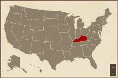
I made the unselected regions of the map appear pale brown, while the actively selected region appears red. Because D.C. appears so tiny on the map that it’s almost invisible, I added an outline around it to draw attention while it’s selected.
When I had been preparing to make USI, I tested out various JavaScript plugins for working with maps. Ultimately I decided on JQVMap (jQuery Vector Maps), which I found to be the easiest to set up, and it had smoother performance than the other map plugins I tried.
In the bottom-right corner of the map section of USI are a pair of buttons for users to zoom in and out of an area of the map (a feature provided by JQVMap).
State Index
On some interactive geographic maps, users may have trouble seeing or clicking on regions that are visually small, even if those small regions aren’t necessarily less important than the bigger ones. On a nationwide map of the United States, this usability problem arises with many of the small states in the Northeast.
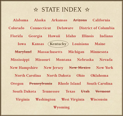
So, I included an alternative option for users of USI to find and select states: the state index. It has an alphabetically ordered list of links with the names of every state (and D.C. too).
Another benefit of the state index is that, unlike the interactive map, the index is accessible to users who rely on navigating websites with only a keyboard instead of with a mouse or touchscreen. Users can focus their web browser onto the state links in the index by repeatedly tabbing (pressing the Tab key), just like on any other accessible web page.
In the index, the actively selected state has its name encircled, and any states that had been selected before during each user’s current session have their names stuck through with a line.
Scrolling Effects
If users have scrolled down the web page to a lower position in the web browser at the time they pick another state to read about, then the page automatically scrolls back to the top of the app’s main content area. This is for the users’ convenience, as they’d need to scroll up the page anyway in order to read the new article from the beginning.
Having that same scroll-to-top effect is a button with an up-pointing arrow that appears in the lower-right corner of the browser whenever the users have scrolled the page far down enough.
State Article Section
Whenever users select a state, whether from the interactive map or the state index, an informational article about that state appears in USI’s state article section for the users to read.
To non-technical users, this quick interaction may look pretty simple, as it should look. However, there’s actually a bit more happening under the hood of the app in order to make it all work.
Mingling with Wikipedia
Even though I designed and developed USI myself, none of the state articles it displays have been written by me. Rather, they’re written, and ever re-written, by myriad individuals globally for the Internet’s most popular free encyclopedia, Wikipedia.
USI connects with Wikipedia’s web servers, then takes a copy of the contents of the article about the user-chosen state. This process, which usually lasts only about a second, is achieved through the MediaWiki Action API, a public application programming interface by Wikipedia’s hosting organization for purposes such as USI’s (among many others).
USI gets Wikipedia articles only on demand; they’re not pre-loaded with the app. The moment when users select a state in USI (for the first time during a user session) is when the app fetches the respective article in its latest published revision that exists on Wikipedia during that moment.
For most of the states, USI simply uses the name of each as the query for getting its article from Wikipedia. However, the names of three particular states fail to go straight to the relevant article because they may often enough refer to something else of the same name. The ambiguous state names are the following:
- “New York” (could mean the major city in the state with the same name)
- “Washington” (could mean the federal capital in D.C. or President George Washington)
- “Georgia” (could mean the unrelated country in eastern Europe)
In those cases, I had to be more specific by appending the string “(state)” or “(U.S. state)” onto the queries, and that solved the problem.
Most Wikipedia articles are open for revisions by anyone at any time, so their current verbatim wordings are always subject to change. Whether the person who last edited an article has improved it or vandalized it is another matter, but that’s beyond USI’s control. I’m mentioning this because I can’t guarantee that every Wikipedia article you read will be well written and have fully accurate, relevant, and unbiased information.
Fixing Up Wikipedia Articles
I wanted to make USI show a brief overview about each state, yet the states’ articles published on Wikipedia are much lengthier. So, I made the app take only the introductory section of a Wikipedia article, omitting all other sections afterward.
Once acquiring an article’s content from Wikipedia, USI modifies certain parts of the content in order to achieve the generally simpler appearance I wanted for it. I made the app automatically do the following actions for any Wikipedia article:
- Remove all images, which is done not only for a stylistic purpose, but a performance one as well.
- Remove all superscript links to cited sources, which usually appear multiple times within every paragraph of an article. (On USI, the footer of each state’s article mentions and links to its original article on Wikipedia.)
- Remove the parenthetical blurb about how to pronounce the state’s name, because I think it’s too disruptive to read mid-sentence. For example, Arizona’s article normally begins with this gobbledygook of a sentence:
“Arizona (/ˌærɪˈzoʊnə/ (listen) ARR-ih-ZOH-nə; Navajo: Hoozdo Hahoodzo [hoː˥z̥to˩ ha˩hoː˩tso˩]; O'odham: Alĭ ṣonak [ˈaɭi̥ ˈʂɔnak]) is a state in the Western United States…” [sic] - Remove all data tables and other miscellaneous bits outside the main text of the article.
- Replace all links as plain text.
- Replace all straight apostrophes ( ' ) with curly ones ( ’ ), because curly apostrophes are more impressive to typography nerds, and they look better in a serif-style typeface as USI uses.
When I was programming USI to find those parts of an article to modify, I mostly used straightforward DOM-based methods when possible. In certain cases, however, I needed to work with relatively more complicated regex pattern-matching algorithms instead.
What's Next?
If your company needs its own web app designed or developed, maybe I can be of assistance!
Similar Projects
To read about another app I both designed and developed myself, see MTG Deck Builder.
To read about another project I designed involving a map of the United States, see the “Top 30 U.S. Companies by Revenue” infographic.
To read about another app’s graphical user interface I designed, see ScoreOS.